TL;DR version: journal aesthetics are just a way of saying you want your junk journal to reflect a certain feel, theme, or vibe. Any journal can be “aesthetic” if it is created to be something that is nice to look at rather than just something that functions, so sling in some stickers and washi tape and different decor approaches to make yours into something visually stunning as well as fun to create.
The term “aesthetic” gets thrown around a lot in scrapbooking and journaling. People talk about “aesthetic” journals, or a journal or page/spread with a specific “aesthetic,” and if you’ve been lurking around many of these communities you’ve probably seen this mentioned before.
Aesthetics (or esthetics, as it is sometimes spelled) is officially “the philosophical study of beauty and taste” – a posh way of saying that art as a concept is (philosophically at least) of a highly variable nature and there are lots of different ways of evaluating, consuming and interpreting any given individual piece of art, from a fine painting to a doodle on a napkin.
In a more modern sense aesthetics are sometimes said to be the core principles of any given design which define what makes it pleasing to the viewer. An aesthetic can feature particular uses or combinations of colors (and the balance of their use), lighting, movement and pattern, scale, shapes, objects and overall mood. If you’ve heard people say that something has a certain “vibe” or “feel” to it then that’s often what they mean – something with a lot of florals in red and pink might have a “romantic feel” or something with a lot of old architecture, black and baroque patterns might have a “gothic vibe.” An aesthetic is just a more formal term for that.
Anything can have “an aesthetic” to it and similarly things described as aesthetic (“that journal is so aesthetic”) are just things meant to be appreciated for their appeal or beauty. Might be art, might be architecture; a dress or suit, a decorated cake, even the way someone has arranged veggies on a platter, everything can be considered aesthetic to some degree or other. Some aesthetics have historic or cultural significance (such as Iki, a Japanese concept relating to subtle displays of taste and wealth), some are amalgams of historic and fictional (like Decopunk, a cool combination of roaring 1920s art deco mixed in with pulp sci-fi elements), while some are driven from highly contemporary looks or tropes from social media, memes, emerging societal sub-groups, and pop culture, especially music (for example, Vaporwave or Voidpunk).
What this all adds up to is the idea of creating a journal (or scrapbook, or notebook, or whatever it is you’re creating) that is “more aesthetic” – i.e. enjoyable to look at, not just something purely functional with the bare bones of what it needs to work. Needless to say this is a pretty big part of junk journaling, since it is so visual, but it can also apply to bullet journals (or bujos, as they’re affectionately called by aficionados) and any other kind of journaling you might be getting up to.
Aesthetic Journal Ideas
Deciding exactly which type of the many, many, many aesthetics you enjoy and might want to theme a page, spread or even entire journal on is a process of inspiration and experimentation, but when it comes to that classic YouTube-style soft and gorgeous journal aesthetic (yeah, not all of them have catchy names, some are just descriptors!) here are some tips to get you started…!
- Theme your pages and spreads (or your entire journal, if you want)! It could be as broad as “nature” or “green” or as specific as “space whales swimming through the astral sea” but having definitive themes in mind can really help steer you in terms of making things more aesthetic. Try starting with a single image or concept/piece of paper and then build on it from there using connections like color or mood or topic, or just sort your inventory by colors and go nuts.
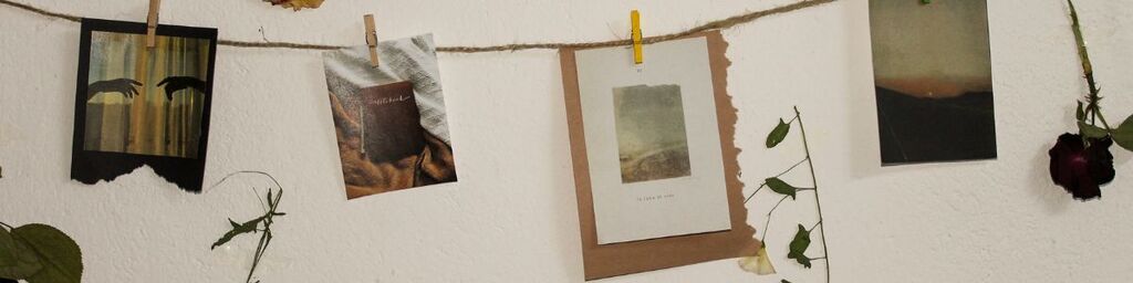
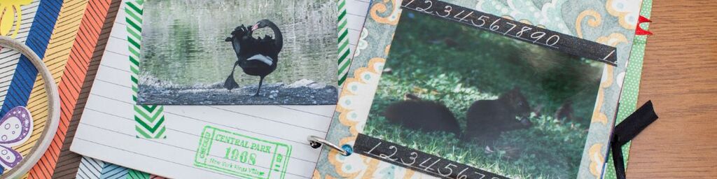
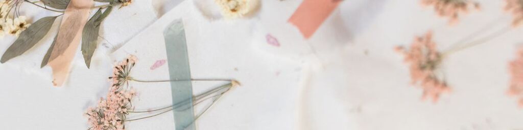
- Set the mood with aesthetic photos. If you’re scavenging your junk journal you can probably find something from magazine clippings that helps pull focus and really set the tone of a spread – a nice scenic sky at sunset, or a moody monochrome old house, for example (it’s another reason I really like using photography magazine clippings for my inventory). You can also buy aesthetic themed packs from places like Etsy or Amazon, or even make your own if you have a good color photo printer on hand.
- Make use of colors. Monochrome is its own kind of look and feel of course, but it can get a bit monotonous (ha!) so most of the prettiest journals will make more use of colors. Soft pastels are popular for that dreamy sort of look, but if you prefer things to really stand out you might want to go vibrant, or maybe combine the two for a pastel background with pops of bright or bold as accents.
- Try out gradients. From soft pastel to vibrant rainbows, gradients can give some much-needed depth to spreads that might be looking a bit flat with blocks of color, and they also make excellent background sheets. Experiment with complementary gradients versus contrasting ones for different effects; what looks dreamlike and gentle on a green-to-blue can become slick and punky on a blue-to-red, for example.
- Slap on some washi tape. This papery decorative sticky tape is a staple of journaling, comes in a range of colors and styles (and aesthetics!) and is generally pretty cheap. You can get narrow washi tapes that can be separators or borders, or extra-wide ones that act as self-contained background papers. Some are little rolled works of art, some are just colors, some are geometric… see what you can find and slap it on – as accents, as page borders, as frames, even as little scraps to make it look like your other spread pieces are taped up like they would be on a bulletin board.
- Mix up texture with other embellishments. Buttons, beads, brads, fabric scraps, textured cardstock or paper, dried flowers… it’s all fair game as junk journal inventory anyway, and adding in different elements not only gives interest to your spreads but can really drive home a particular aesthetic and theme if you’re selective about what you add. Make sure you use the right glue though – a standard glue stick won’t hold everything down properly!
- Add some stickers as accents. Stickers are great! Yes, they cost money (unless you have a fancy Cricut machine or something to make your own, you hedonist) but often not much, and they can bring in all kinds of extra aesthetics from flowers to animals to little symbols and icons like arrows or even emojis. Plus they often have different textures, from gloss or matte to puffy or glittery or holographic, which can help tie a spread together or throw in something that really stands out.
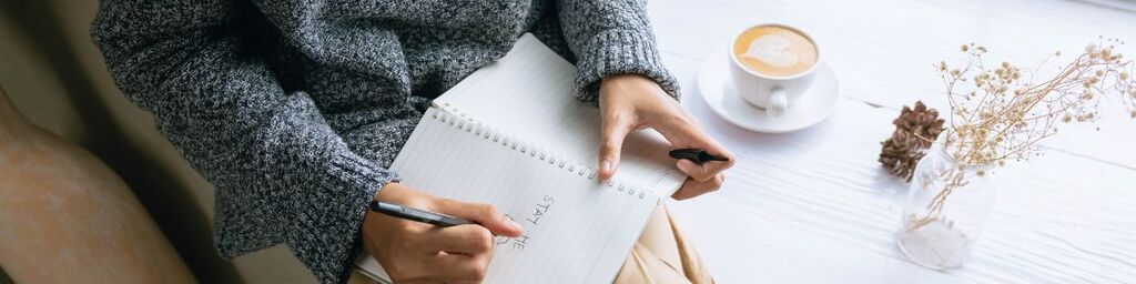
- Mix up your words. Using a mix of handwriting or calligraphy, printed word or phrase stickers, stamps, or even label makers (I really like the typewriter-style effect of a Dymo embossed label!) you can add different textures and feels to the wordy bits of your journal. Glass dip ink, fountain pens, date or letter stamps in different colors… all can add that little something different and extra to give your journal a real vibe.
Hopefully that gives you some ideas and inspiration to get started with. There are basically an infinite number of aesthetics you can adopt for your journal, and you can mix and match to make something your own as much as you want – as long as you’re enjoying the process of creating, and keep experimenting until you also love what comes out when you’re done… it’s literally impossible to do it wrong!